
In mid-2022, I was assigned to redesign the buyer experience for Desty Menu, aligning it with the new branding, including updated colors, typography, and style guidelines.
Desty Menu is one of Desty's key products, specializing in QR ordering solutions for F&B businesses. As part of this project, I maintained a design system used by 400K users and contributing to 100 billion GMV.
Desty Menu introduced new design guidelines, requiring the product to be updated accordingly while ensuring a consistent and improved user experience.
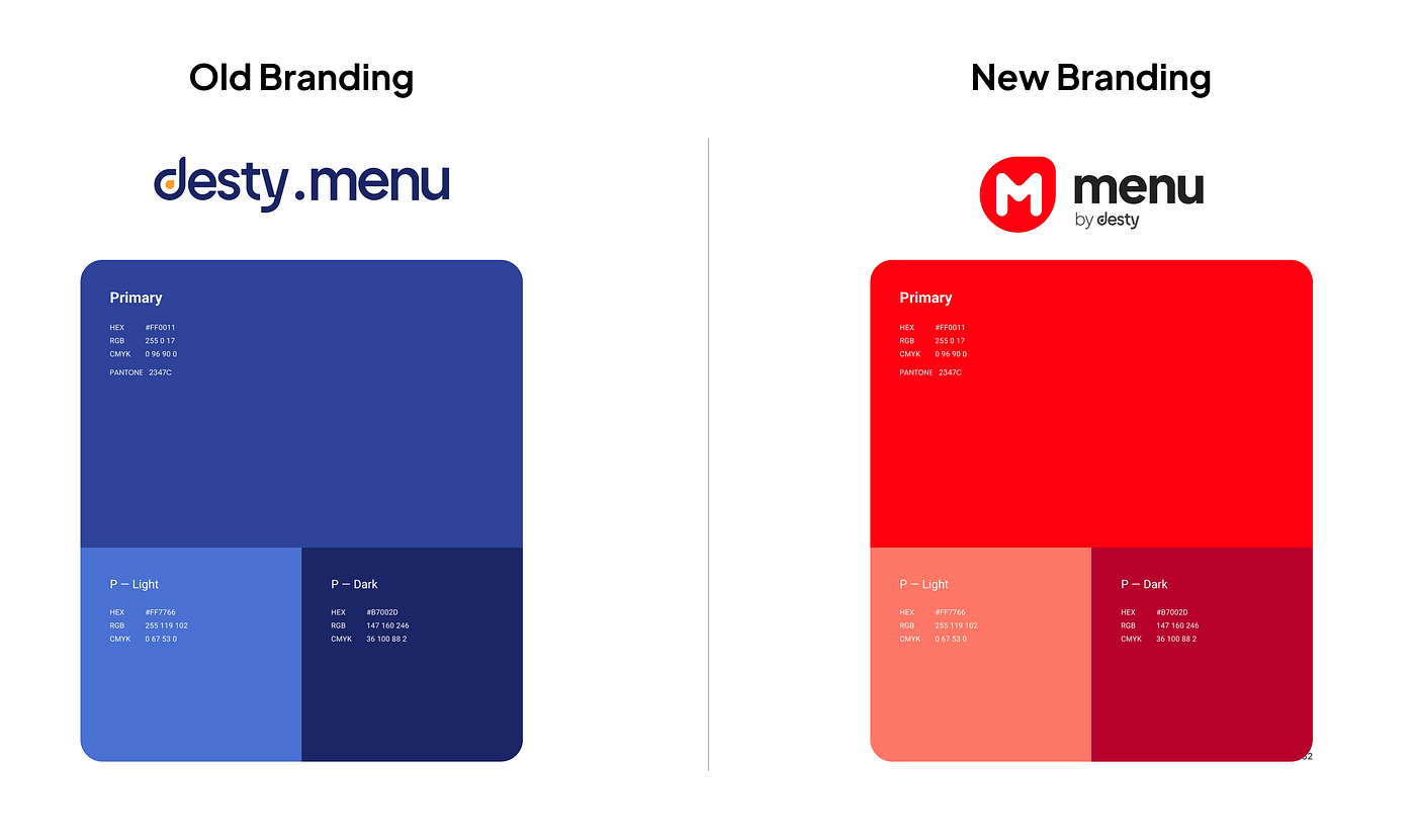
Our goal was to align Desty Menu with the new brand guidelines, enhancing the design to be more modern and visually appealing.
We focused on three key areas:
We documented all key elements, including typography, colors, components, elements, and icons, ensuring a structured approach to implementation.